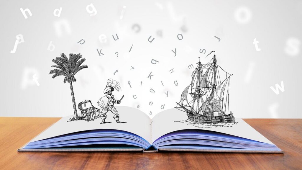
Typography shapes the way we perceive visual communication. Much more than a question of aesthetics, typography is the silent voice of our texts. In this article, we explore the world of typography with rigor and insight through the eyes of visionary Timo Rieke, whose ideas resonate throughout the field of graphic design.
Typography plays a pivotal role in graphic design, lending character and personality to our messages. By discussing the philosophy and teachings of Timo Rieke, a leading typography expert, this blog post sheds light on the vital importance of this art form in graphic design.
The Art of Typography
"Typography is the art of giving lasting visual form to human language," says Robert Bringhurst. This statement underlines the impact of typography as a pillar of visual communication. It's not just a design element, but the receptacle of our language, emotions and intentions.
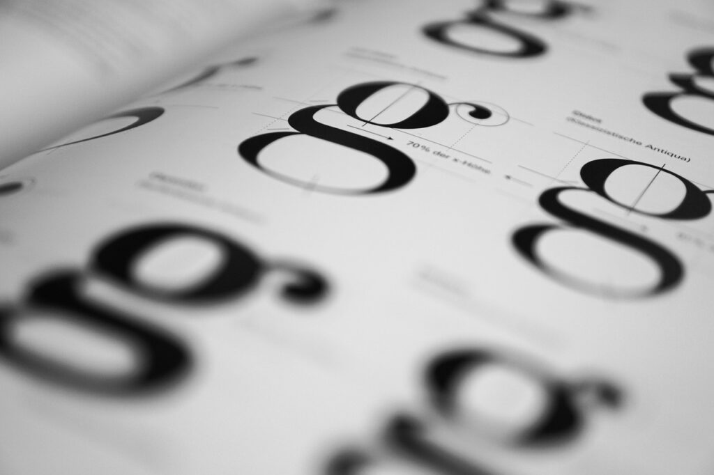
The Importance of Legibility
Legibility is a fundamental aspect of typographic art, crucial to the effective and clear transmission of messages. Timo Rieke insists on the importance of font choice and layout to optimize reader comprehension. In his view, effective typography should always prioritize ease of reading over pure aesthetics.
Visual harmony and coherence
Timo Rieke advocates a balance between innovation and tradition, ensuring that typographic harmony aligns with the nature of the content. Decisions on contrast, spacing and alignment are not just a matter of visual beauty, they are essential to creating an unobstructed user experience that subtly guides the reader through the text.
Timo Rieke's expertise reiterates that typography should never be an afterthought in graphic design, but rather an element of strategic thinking that reinforces and clarifies the message. His thoughtful, progressive approach embodies the quintessence of what typography should be in modern design.
Timo Rieke's Perspective
Timo Rieke defends the idea that "the beauty of typography lies in its ability to convey not only language, but also emotion, meaning and intent." This suggests that typography is not just aesthetic, but imbued with emotional and communicative power.
Timo Rieke's Typographic Philosophy
Timo Rieke, with his discerning eye for typography, sees it as a vehicle for cultural identity and personal expression. For him, the choice of a typeface is not limited to its form, but encompasses the cultural nuances and character it imbues in the text. He postulates that each typographic typeface conveys a history, an origin and, consequently, a particular impact on the message.
Choice of Fonts and Brand Personality
The link between typography and brand image is inseparable in Timo Rieke's strategic mind. He maintains that the choice of fonts must reflect the brand's personality and reinforce its positioning in the market. A font is not just a style, it's a voice. It must therefore be selected with discernment to align the visual identity with the company's communication tone.
Multimedia Integration and Dynamic Typography
In our digital age, Timo Rieke anticipates and embraces the evolution of typography towards more interactive and animated formats. His perspective on dynamic typography highlights the importance of adapting fonts to various media, ensuring their transmedia effectiveness and adaptability to new technologies, thereby amplifying the consumer experience.
Rieke urges designers to think beyond the printed page, to explore the frontiers of the digital, and to conceive fonts that not only live but also react in multimedia contexts. Typography, according to his vision, should have the power to evolve fluidly between the various points of contact with the user.
Timo Rieke's typographic philosophy, combining traditional wisdom with bold innovation, resonates like a compass for graphic designers worldwide, inspiring them to practice the art with intention and strategic intelligence.
Impact of Typography in Design
Typography is the foundation on which all graphic design is built. The power of typography transcends mere font selection; it structures content, commands attention and directs consumer behavior. Timo Rieke, with his educated approach, highlights how typographic choices can affect the mood and perception of a brand.
Brand identity communication
Typography is a vector of brand identity, conveying a company's values and personality to its audience. The fonts chosen speak about the brand even before the consumer reads a word. Through Timo Rieke's eyes, it's clear that typography has a subtle but decisive influence on the way a brand is perceived and received in the minds of consumers.
User Interaction and Experience
In every design, typography either facilitates or hinders the user experience. Timo Rieke emphasizes that the clarity, legibility and attractiveness of fonts are paramount to ensuring frictionless interaction. Typography and UX design are inextricably linked; well-structured text raising visual interest catalyzes user engagement.
Psychological impact of policies
Each typeface carries a specific emotional charge that influences the psychological reaction of consumers. Timo Rieke educates on the importance of typographic psychology in graphic design. A font can evoke confidence, excitement, comfort, or any other feeling that, when harnessed judiciously, strengthens communication and forges deeper relationships with the public.
Contributions to Accessibility
Timo Rieke asserts that typography must also be a pillar of accessibility in design. It must be used to create content that is accessible to all, including people with visual or cognitive impairments. The graphic designer's social responsibility is to ensure that communication is universally acceptable.
The impact of typography in graphic design, according to Timo Rieke's teachings, is profound and multidimensional. He insists that typography must be considered with seriousness and foresight, as it shapes not only the appearance, but also the very essence of the message conveyed.
Practical Tips for Graphic Designers
Graphic designers must balance visual appeal with legibility and clarity of message. Timo Rieke's expertise and the clarifications provided by iconic figures such as Hermann Zapf, who asserted that "good typography should be practically invisible; it should not draw attention to itself, but rather support the content", serve as a guideline for effectively integrating typography into design projects.
Consistency: the cornerstone of Visual Identity
It's crucial that graphic designers maintain typographic consistency across all designs for the same brand. This systemic approach strengthens visual identity and ensures that the public instantly recognizes the brand, whatever the medium. Timo Rieke recommends developing typographic standards that serve as references for all brand communications.
Exploiting Negative Spaces
Rieke advocates the judicious use of negative space to increase legibility and draw the eye to key elements. He reminds us that emptiness is a contrasting component that must be handled with precision to balance aesthetics and functionality, creating an intuitive and satisfying user experience.
Adapting Typography to Communication Channels
In a world where digital and print media coexist, the adaptability of typography is essential. Graphic designers must select and test fonts for different media to ensure faithful reproduction and the desired impact, whether on screen or on paper.
Legibility for the User Experience
Timo Rieke stresses the importance of legibility for an optimal user experience. The choice of font size, line spacing and line length must be made with care to promote easy, pleasant reading. Well-organized, well-spaced out text facilitates comprehension and holds the user's attention.
Typographic experimentation
Finally, Rieke encourages graphic designers to dare typographic experimentation. Expanding creative horizons with new fonts or bold layouts can produce innovative work that pushes a brand to stand out. However, these explorations must remain aligned with the brand's values and image so as not to blur its message.
Timo Rieke's advice is invaluable for any graphic designer seeking to refine his or her typographic art. They combine an innovative perspective with practical application, which together elevate typography to a strategic tool in the arsenal of communication design.
In conclusion, typography is an essential aspect of graphic design that transcends the simple selection of fonts. Inspired by Timo Rieke and other masters of typography, we are called upon to rethink the way we use typography to enrich our graphic creations. So, dear graphic designers, pay renewed attention to typography: your work and your ability to communicate effectively could be transformed.