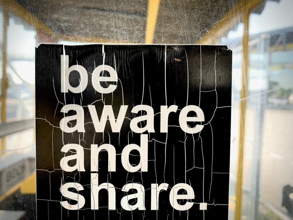
Typography is the soul of visual design; it not only communicates a message, but also shapes the way that message is perceived. In a world where branding and visual presentation can make or break a company's reputation, getting typography right is a crucial skill for any designer. Our comprehensive guide takes you through the key steps to unearthing the font that will bring your projects to life.
Understanding Typography
Typography is the art of arranging text in such a way as to make it legible, comprehensible and visually pleasing. Successful typography enhances the user experience by facilitating navigation and enriching the message. Timo Rieke explains in his book "Typography and Graphic Design" that typography is more than just a vehicle for content; it's a powerful design tool.
The Importance of Typographic Choice
The choice of typography should never be left to chance. Each typeface conveys its own personality and emotional undertones. One typeface may evoke reliability and professionalism, while another may convey a feeling of relaxation and accessibility. So a company needs to think about the impact its typography will have on customer perception. It's a strategic decision with direct implications for the brand.
Typography Selection Criteria
Matching a typeface to its context of use is essential. It's essential to consider several key criteria: legibility, suitable for both print and digital display, harmony with the brand's visual identity, technical aspects such as font file weight, and compatibility with various browsers and operating systems. It's also important to respect trends while preserving the brand's uniqueness and authenticity.
Typography and User Experience
Well-chosen typography enhances the user experience by providing a clear hierarchy of information and making it easier to understand the message. It plays a role in the user journey, guiding the eye through the various content elements. In this way, the right typography contributes not only to the aesthetic beauty of the design, but also to the effectiveness of the communication.
As a design element, typography requires in-depth understanding and meticulous application. This guide will continue to reveal strategies for mastering the intricacies of typography, so you can leave an indelible mark through your graphic designs.
Factors to consider when selecting typeface
Selecting the right typeface for your project requires careful attention to several key factors. These elements not only contribute to the coherence and visual appeal of your project, but also influence the overall experience of your audience. Here are the key factors to consider:
Context of use
It's essential to understand the context in which the typography will be used. Is the content digital or print? What is the main message and who is the target audience? Typography that works well in a fashion magazine may not be appropriate for a corporate annual report.
Legibility and accessibility
Make sure that the typography you choose is easy to read in different contexts. This includes font size, line and letter spacing, and color contrast. Legible typography enhances the accessibility of your content to a wider audience.
Harmony with brand identity
Typography must be in harmony with the brand's values and aesthetic. It should complement and reinforce the brand image, rather than dilute it. Think about the emotion or impression you want to evoke in the viewer through the choice of typography.
Weight and performance
In the digital world, font weight can affect the loading time of your web pages. A lighter font will improve site speed, which is crucial for a good user experience and SEO ranking.
Compatibility
Check font compatibility with different browsers and operating systems to avoid display problems. This is particularly important for websites and mobile applications.
Rights of use
Before finalizing your choice, make sure you understand the licensing terms of the typeface. Some fonts may be free for personal use, but require the purchase of a license for commercial use.
Choosing the right typography is an art that requires meticulous consideration of these factors. By taking them into account, you can greatly enhance the impact of your project and ensure effective, memorable visual communication.
Practical Tips for Choosing Typography
Selecting the ideal typeface can seem daunting at first, but with a few practical tips, the process can become not only more manageable but also more enjoyable. If you take the following suggestions into account, you'll maximize your chances of finding the typeface that perfectly matches your project.
Experiment with contrasts
Don't be afraid to mix different fonts to create dynamism in your design. Contrasting fonts can help prioritize information and guide the reader's eye. However, make sure that the fonts you choose share a certain harmony and don't compete for attention.
Consider Ambiance and Tone
The typography you choose conveys a mood and tone even before the first word is read. Think about the impression you want to leave: is it serious and professional, or more playful and relaxed? Make sure the personality of the typography aligns with the message of your brand or project.
Use Online Resources and Tools
There are many online resources and tools that can make the typography selection process easier. Sites such as Google Fonts, Font Squirrel, and Adobe Fonts offer vast libraries that can be easily filtered by style, weight and license. Use these tools to compare and visualize how different fonts work together.
Test readability on multiple devices
With the plurality of devices and screen sizes today, it's crucial to ensure that your typography is legible across all media. Test your font choices on different devices to ensure a consistent and accessible user experience.
Don't Underestimate the Importance of Space
The spacing between characters (kerning), words and lines (leading) can radically affect the appearance and legibility of your text. A typeface may look perfect in isolation, but its appearance can change dramatically when put into context. Don't hesitate to adjust spacing to optimize legibility and aesthetics.
By applying these tips, you'll be better equipped to make an informed and strategic choice when it comes to typography, an essential element of any successful design. Remember, typography is more than just a matter of style - it's a powerful tool for enhancing communication, reinforcing brand identity, and improving the user experience.
Tools and Resources for Typography Selection
To select the typeface that will best resonate with your project's aesthetic, it's essential to arm yourself with the best tools and resources. Here's a meticulously crafted compilation that will equip you to make informed and accurate decisions in your typographic quest.
Font directories
- Google Fonts : This popular online directory offers a vast collection of free, open-source fonts, perfect for web projects.
- Adobe Fonts Ideal for professionals, Adobe Fonts offers a wide range of high-quality typefaces for all types of creative projects.
- Font Squirrel For free, commercial-ready fonts, Font Squirrel selects the best options for designers.
Visualization and Test Tools
- Typecast (Adobe Typekit Practice): A tool that lets you test and visualize fonts, facilitating comparison and the final choice.
- FontPair : Helps you match and compare Google Fonts to find the perfect combination for your design.
Inspiration Libraries
- Typewolf A reference point for typographic trends, Typewolf presents inspiring examples and recommendations for alternative fonts.
- Behance Discover creative typography projects by professionals from all over the world to inspire your selection.
Typography Analyzers
- WhatFont A browser extension that lets you quickly identify the fonts used on websites.
- Font Identifier from Creative Market: Upload an image and the tool suggests similar fonts available for purchase.
Educational Guides and Articles
- I Love Typography A website offering detailed articles, stories and tutorials on typography.
- Smashing Magazine : Feature articles and practical guides on all facets of design, including typography selection.
By exploiting these tools and resources, you'll deepen your understanding of typography and refine your choices so that every project reflects an impeccable, impactful brand image.
Keep in mind that choosing the right typography is essential for an effective and impactful project. This process requires thought, experimentation and creativity. By following the advice in this guide, you can confidently select typography that not only aligns with your project objectives, but also enriches the user experience. Typography is a creative form of expression; let it speak for your project with clarity and boldness.


